Pablo Picasso once remarked, “Colors, like features, follow the changes of the emotions.” Everyone has an opinion on color. And, while it seems as though our responses to them are entirely subjective, decades of research support the theory that color can affect our mood, behavior, and even influence physiological reactions. This is why color has been so extensively explored as a communication tool in art, design, and marketing.
Feelings about color are often rooted in personal experience or shaped by one’s cultural background. Despite these individualized influences, existing research does allow for the following generalizations to be made:
- Colors, including red, yellow, and orange, are considered “warm” colors and are thought to stimulate
emotions of excitement. - “Cool” colors include blue, violet, and green and are associated with calmness, coolness, and tranquility.
- High saturation colors are more stimulating than low saturation colors.
(Saturation is defined as how “pure” a color is.)

Studies have shown that color has a strong influence on people’s perception of an environment. In fact, color accounts for up to 90 percent of first impressions, according to color psychologists. A study of the world’s 100 top-performing companies discovered that the majority used blue in their branding. This is most likely because the color blue conveys trustworthiness and credibility to customers. For employees, this can be interpreted as accountability and transparency—feelings known to boost morale.
 Color not only has the ability to affect a person’s mood, but it also can hinder effectiveness. There have been numerous studies conducted which show that certain colors can have an impact on performance and productivity. This is why more and more interior designers are considering the psychology of color when designing workplaces. Here are some of the ways color can be used in spaces to help facilitate specific actions:

- Blue – Is considered to be stable and calming, aids intuition, and helps workers focus on the task at hand—making it a good choice for brainstorming spaces and spaces where attention to detail matters.
- Green – is known to alleviate anxiety, boost creativity, inspire innovation, and enhance creative performance. Green helps people remain calm and efficient at the same time, making it useful for workplaces where people work long hours. It’s also been scientifically shown to reduce eye strain, which makes it ideal for spaces where computers are often used.
- Yellow – has been acknowledged to activate memory, induce optimism, stimulate creativity, encourage focus and direction, and promote innovation, making it ideal for high-energy, creative spaces.
- Red – has been known to increase heart rate and blood flow, as well as invoke emotion and attraction. It’s a good color accent for places that support physically demanding jobs. Used sparingly, it also can help increase performance in employees who have detail-oriented assignments.
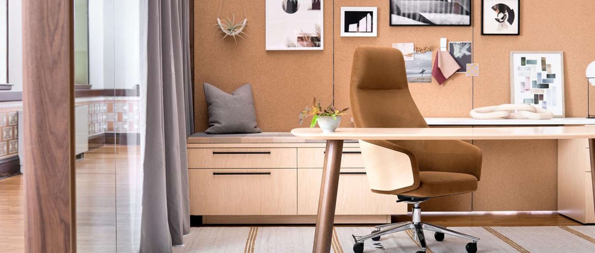
- Orange – is associated with warmth, enthusiasm, and encouragement. It’s been shown to improve cognition and alertness, encourage socialization, and boost creative performance, which makes it great for community and collaborative zones.

While it may be tempting to use color boldly throughout a space to induce specific worker behaviors, research has also shown that having too much of one color can leave us feeling off-balance. Carefully considered accent colors are an effective way to influence work activities while creating harmony and balance in a workspace.